Bölümler ve Konular

Posted in Genel on 14 Nisan 2011 by onuroral

Dergi Adı:

Tortu

Bölümler:

  • Tortu: Aperatif Zeka (Şarap hangi konumda saklanmalı, dik mi, ters-yüz mü?)
  • Tortu: Data (Ülkelere göre şarap üretimi, hangi ülkeler daha fazla şarap üretiyor?)

Konular:

  • Bilgisayar Çağındaki Süper Kahraman (Mark Elliot Zuckenberg) – Facebook’un kurucusu Zuckenberg’in kısa hayat hikayesi.
  • Tek Hareketleri Yüzlerce Kelimeye Eşdeğer – Vucut dili daha efektif nasıl kullanılabilir.

Constructivist Furniture Design

Posted in Genel on 06 Nisan 2011 by onuroral

The following furniter/interior designs are made by Julien Jockers (ArmadaQuadrat). It is called HIL chairs which are made from black or colored acrylic and acrylic glass. There are 2 versions, each available in 7 different colors.

Column Trials

Posted in Genel on 05 Nisan 2011 by onuroral

2 and 3 columns on 0.75 cm margined guides.


experiment with 3 column with images.


experiment with 4 columns.


experiment with the use of negative space.


Magazine Structure

Posted in Genel on 04 Nisan 2011 by onuroral

0.75 cm spaced, guided structure. the blue areas represent page margins. mostly i will try to use those spaces empty, but if i decide use blended images i will try to give the balance accordingly to that decision.

dark red boxes represent typographic elements which are texts and headers, light red areas represent images, page numbers etc…


sometimes i may need to give lots of information about the content on a page. that is what i tried to do on this example. when i use boxes to represent elements, it looks chaotic, but when i replace boxes with texts it does not look that way.


again i tried to give a lot information on those 2 pages.  the first-seen difference from the 1st example is divided images on the right page, and a smaller image on the left-top page. there is also a slight difference which is spreaded texts on the right page. if you look closer to the example 1 and 2, you can see that the in the 1st example the bottom texts (dark boxes on the both pages) are aligned horizontally. but in this example they are not aligned, 0,25 cm divided. also top texts on the right page…


i experiment with 0,75/2 cm (0,375 cm) and 0,75 cm. i also tried to use blended images and some texts overlapped with an image. in my research i saw some overlapped texts with an image, and if the exposure of the image is too high or the image is so detailed, texts are put on a box in order to separate and make them more readable. that decision depends on the image on most cases.

here are some other experiments i have done:


Magazine Research

Posted in Genel on 04 Nisan 2011 by onuroral

#1  – first of all in this example, the designer breaks the guide system with irregular lines. outlines on page are in a relation with header and illustration. also in order make a hierarchy some texts on the right page are on irregular drawn boxes. pages are divided into 3 columns for texts. texts are left aligned. on the right page, irregular drawn boxes breaks the systematic rule of page, which makes it look less boring.


#2 – in this example, the structure of page can be easily seen. the designer completely obey the structure while putting texts and images. on the left page, an image put on the background and 2 boxes to seperate texts and header from image, and to make  it more readable. the right page divided into 3 columns. even the quotation text with brackets and images which are put on a box on the bottom are not divided, they are still in a relation with the whole structure of the page.


#3 – in this example, the whole 2 page is divided with a rectangle, which also divides title+subtitle from the whole page on the left. the ‘+= signs on the top of the pages make a continuity. on the center of the left page, an image divides texts. the structures on both pages are alike, but because of the different lenght of information, the designer tried to make a balance by putting some texts on the top of the image (right page), and by putting ‘+’ signs on the bottom of the page.


#4 – this example looks like the example #2. but apart from #2, this one breaks the structure with titles typography and  position of subtitle. the left page divided into 2, and you can see that from texts. width of texts are same, and they are in a relation with the position of header.


#5 – the left page texts and images are put on a green box. the green box made the text more readable even the designer used blended images. the photo of the man on the center and the image on the top right of the left page is breaking the structure. on the right page again blended images are kind of breaking the structure.

Gestalt

Posted in Genel on 04 Nisan 2011 by onuroral

what is gestalt?

when we look at a complex combination of different elements, firstly we see the whole, the the individual elements which forms the whole. this basic idea is called gestalt.

gestalt principles in editorial design

alignment & ambiguity & grouping:

alignment is the first principle in order to create a system, organizing elements and materials. almost all texts use alignment to organize type. alignment works best with elements which have straight edges like rectangles. you can use edge alignment and center alignment with rectangular elements. if you have elements which have no straight edges (like a circular shape), most used system is center alignment. if you have a working system on your page, you can make the audience to see your system clearly by aligning elements perfectly. but also you can decide to break the system and alignment on purpose. i said ‘on purpose’ because sometimes it might be seen like ambiguity. if it is explained by an example, a symmetrical design can be boring, you may want to distort the symmetry and create an asymmetrical design. asymmetry does not mean unbalanced. you can use negative spaces to create a perfect balance. in my opinion russian constructivists did that in a perfect way. in editorial design grouping (clustering) can be made by location, size, color etc… even the typeface that used can make grouping. in most cases, if the page has a lot of texts, and the designer needs a grouping system on 12pt texts, they put texts on a colored or outlined box to separate from the others.

Dergi icin…

Posted in Genel on 04 Nisan 2011 by onuroral

bolumler:

1-yemek tarifleri

2-unlu sefler

3-gezi rehberi

4-kitaplar

5-sarap web siteleri/bloglari

6-kozmetik/saglik

7-kultur/sanat

8-tarih

9-eglence


konular:

1-hangi sarapla, hangi yemekler yenmeli.

2-en iyi olarak gosterilen yeni sefler.

3-turkiye’deki sarap muzeleri – ‘kutman sarap muzesi’

4-sarap hakkinda yazilan en iyi 10 kitap.

5-en cok ziyaret edilen sarap blog’lari.

6-sarabin sagliga yararlari. beyaz sarap, kirmizi sarap kadar yararli mi?

7-en iyi sarap resimleri / fotograflari.

8-ilk sarap? arkeologlar ilk sarabin izini tas devrine kadar surduler.

9-romantik bir restaurantta, sarap siparisi icin atilmasi gerekilen 10 adim.


Dergi icin isim:

maya

fermente

kudas

bocut

küf

kupaj

kav

tortu

vitikultur

truth association: Mubarak, King Abdullah, Bush

Posted in Genel on 23 Mart 2011 by onuroral

Advertising Agency: ex’cellent marcom agency, Haifa, Israel
Creative Director: Ashraf Fawakhry
Copywriter: Aroub Rinawi
Typographer: Ashraf Fawakhry
Published: March 2011

i like the idea and execution of using silhouettes of figures as patches to form portraits. Also clean typeface that designers chose is balancing the visuals, making hierarchy more clear.


Violina Patterns

Posted in Genel on 16 Mart 2011 by onuroral

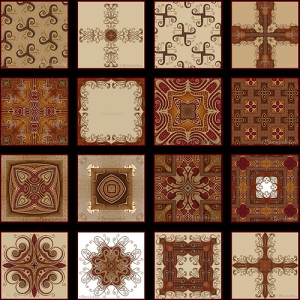
original website is http://www.indrikov.com/pattern_violina/pattern_violina.html .. you can find lots of nice patterns as you can you for wallpapers etc.. i like the way they look modern orientalist patterns.

Pepsodent Torsion Ads

Posted in Genel on 09 Mart 2011 by onuroral

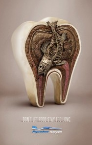
“Don’t let food stay too long. Pepsodent Torsion.”

Advertising Agency: Lowe, Jakarta, Indonesia
Executive Creative Director: Din Sumedi
Art Director: Adam Pamungkas
Copywriter: Bondan Esp
Photographer: Clarissa Peddy Photography
Retoucher: Rudy